Insulet Brand & Product Icon System
Creating a Scalable Icon System Across Product and Marketing Insulet.com and Omnipod.com
Standardized iconography across platforms to improve consistency, usability, and team efficiency.
COMPANY
ROLE
Senior Web UX Designer
TIMELINE
2022-2024
PROJECT TYPE
Design System / Visual Language
PROBLEM
While co-designing Insulet’s digital experiences—including insulet.com and omnipod.com (HCP side)—I encountered a recurring issue: iconography was inconsistent across product and marketing platforms.
Different teams were using varying styles, formats, and visual languages, leading to fragmentation in the user experience. This inconsistency impacted usability and slowed down design and development workflows, as assets were often recreated or modified ad hoc.
The lack of standardization also led to teams creating and modifying icons independently, further reinforcing inconsistencies and making it difficult to maintain a cohesive visual language across platforms.
This lack of standardization extended beyond iconography into product branding, where logos were used inconsistently across platforms in terms of typography, casing, and color.
CONTEXT
Large UX team within organization (~40 designers)
Collaboration across product, marketing, and development teams
Medical / regulated environment
Assets used across multiple platforms and global markets
APPROACH
Having experienced the inconsistency firsthand, I proactively championed the need for a unified icon system. I began by auditing existing icon usage across both product and marketing surfaces to identify gaps in style, scale, and application.
From there, I worked closely with marketing stakeholders to align on a shared visual language that would support both brand expression and product usability. In parallel, I focused on building a scalable system that would not only standardize design but also simplify how assets were created, exported, and accessed by teams.
In addition to iconography, I identified similar inconsistencies in product logos and began advocating for a more unified approach to branding elements across the organization.
KEY CONTRIBUTIONS
Championed and led the standardization of iconography across product and marketing
Audited and identified inconsistencies in existing icon usage
Defined visual guidelines to ensure consistency in style, scale, and usage
Collaborated with marketing to align brand and product visual language
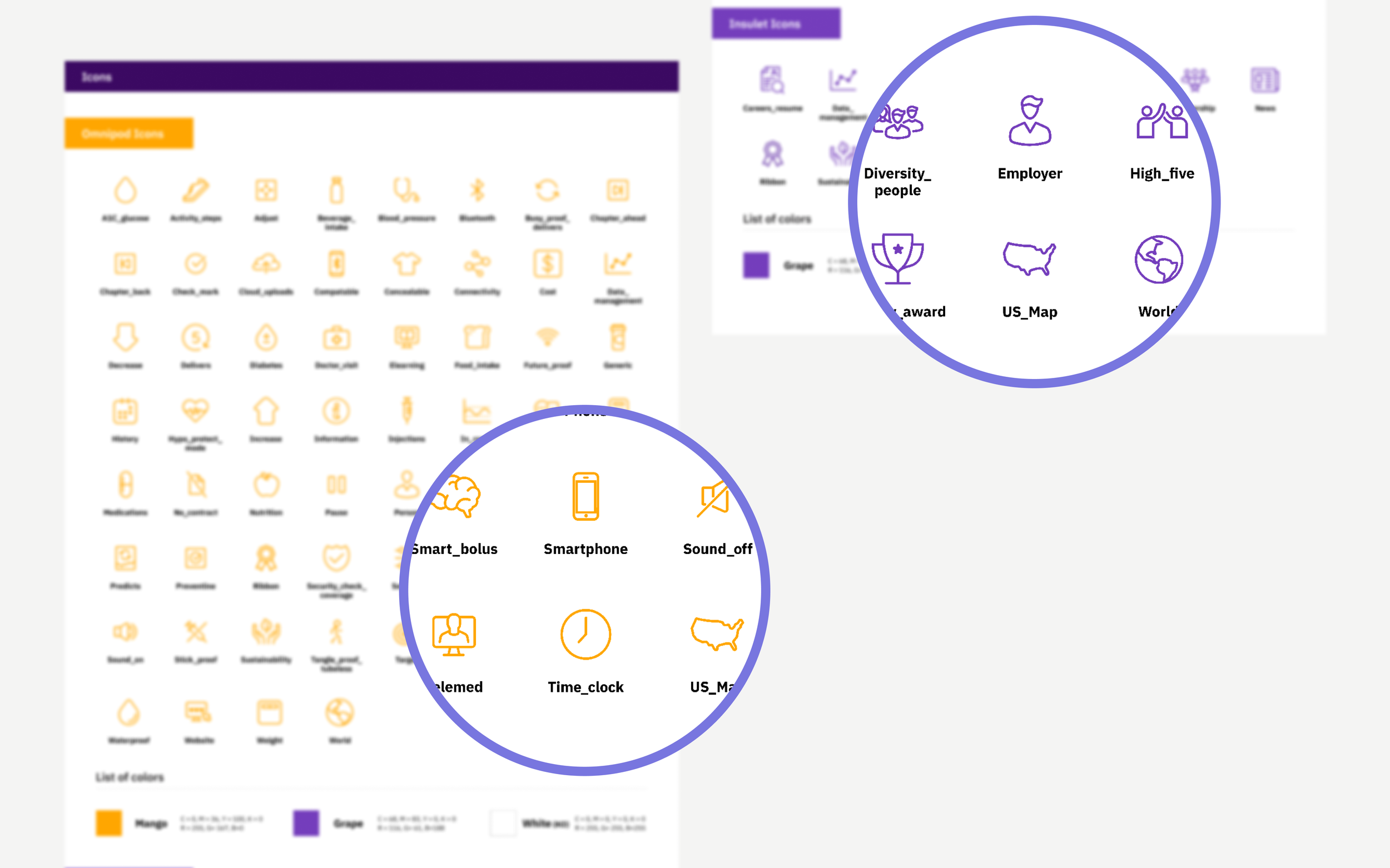
Produced a complete icon library in multiple formats (SVG, PNG, EPS) and color systems (RGB, CMYK)
Designed a centralized contact sheet to improve accessibility and adoption across teams
Identified inconsistencies in product logos and advocated for alignment across branding elements
SOLUTION
The final solution was a centralized and scalable icon system that unified visual language across platforms. It included a comprehensive icon library, standardized guidelines, and an accessible structure for distribution.
This system enabled teams to quickly find, use, and implement icons consistently across both product and marketing experiences.
The system also established a clear source of truth, providing teams with an approved set of icons to use across all materials. This reduced the need for ad-hoc icon creation and ensured consistency across both product and marketing outputs.
While the icon system was implemented across teams, the work also informed broader conversations around visual consistency, including product logo standardization.
IMPACT
The introduction of a unified icon system improved visual consistency across Insulet’s digital ecosystem and reduced duplication of effort across teams.
By centralizing assets and standardizing usage, the system streamlined collaboration between design, marketing, and development, enabling faster production and more efficient workflows.
It also reduced the creation of unapproved or inconsistent icons by providing teams with a clear and accessible standard.
The initiative also helped surface broader opportunities for visual consistency, influencing discussions around standardizing additional brand elements such as product logos.
REFLECTION
This project reinforced the importance of identifying and addressing systemic design issues, even when they fall outside of immediate project scope. Championing consistency across teams requires both design thinking and cross-functional alignment, especially in large organizations.
This experience reinforced the value of identifying system-level inconsistencies beyond the initial scope of a project, and advocating for improvements that can scale across an organization.