Cuviva’s Platforms for Patients and Doctors
Bringing Structure to a Fast-Moving Healthcare Platform
Establishing scalable UX foundations across connected patient and doctor experiences
COMPANY
ROLE
UX Designer
TIMELINE
2026
PROJECT TYPE
Product Design / Design Systems
PROBLEM
When I joined Cuviva, the product was being developed in a highly reactive, fast-paced environment. Design work was primarily driven by immediate needs, with little time allocated to foundational UX practices.
There were no wireframes, no clearly defined user journeys, and limited information architecture guiding the product. Design decisions were often made directly on final UI screens, leading to inconsistencies and making it difficult to maintain a cohesive experience across the platform.
This lack of structure also created challenges in collaboration with developers, as there was no clear source of truth or shared understanding of flows and system behavior.
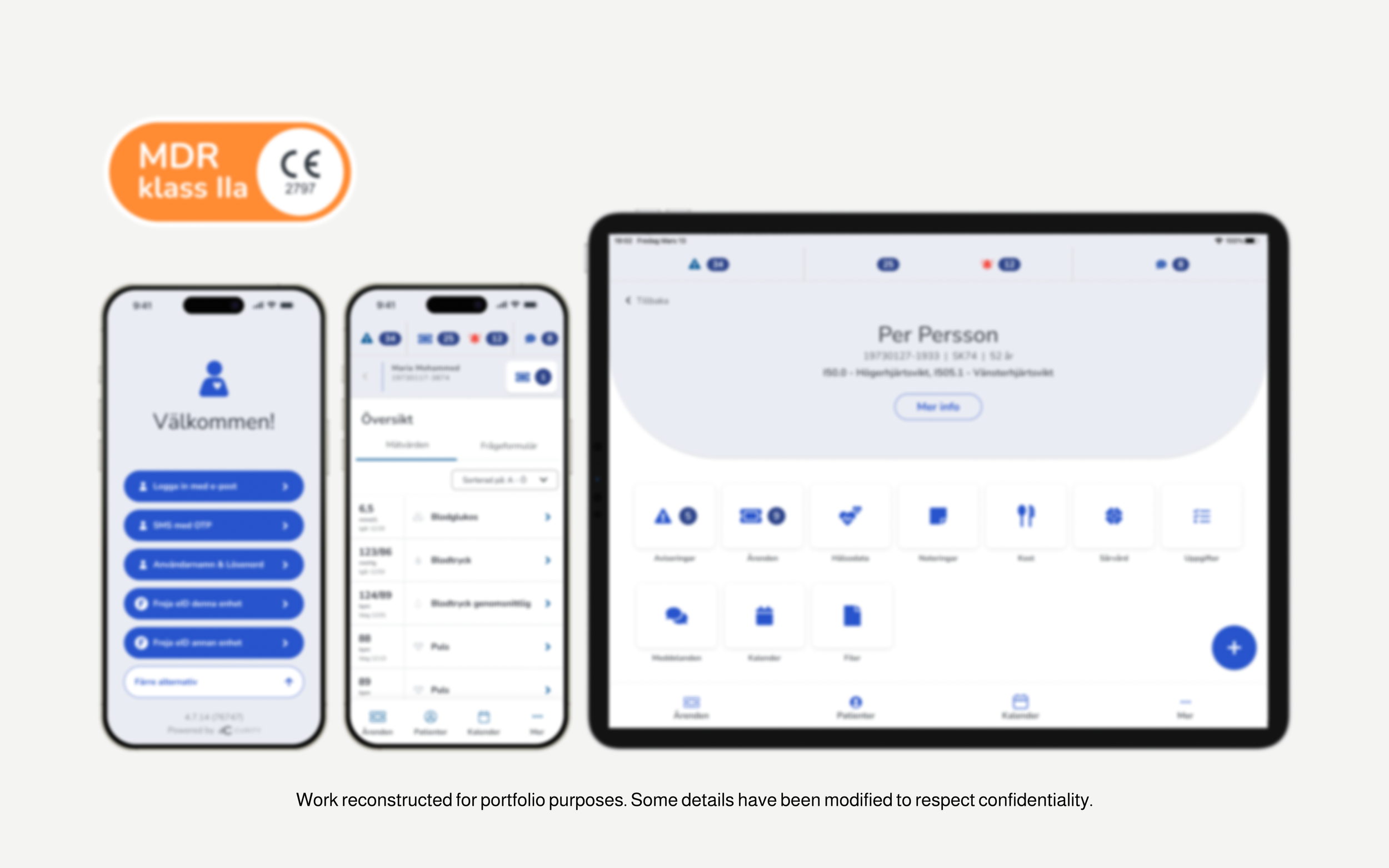
I also identified inconsistencies in how regulatory elements such as MDR, CE Mark, and BSI certifications were being used across materials, creating potential risks in how the product was presented.
CONTEXT
Expanding company (~40 employees)
Two interconnected platforms:
CTM (Control Tower) – used by doctors and caretakers
CM (Companion) – used by patients
Mobile and web experiences for both platforms
Small UX team (2 designers)
Fast-paced, reactive product development
APPROACH
I focused on introducing structure without slowing down delivery. Rather than attempting a full redesign, I prioritized foundational elements that would have immediate impact while supporting long-term scalability.
This included establishing user journeys and information architecture to define how the system should behave, introducing wireframing as a standard step in the design process, and building reusable components to ensure consistency across both platforms.
In parallel, I identified opportunities to standardize visual elements such as iconography to support future growth.
I took initiative to better understand regulatory requirements and ensure that certifications and compliance-related elements were represented accurately and consistently across the product and marketing materials.
KEY CONTRIBUTIONS
Defined user journeys to map interactions between doctors and patients across both platforms
Established foundational information architecture to improve structure and navigation
Introduced wireframing as a core step to improve clarity and alignment before visual design
Designed end-to-end wireframes for both CTM (doctor-facing) and CM (patient-facing) platforms
Built reusable components and variants in Figma to support scalability across web and mobile
Improved consistency across two interconnected products with different user needs
Collaborated closely with developers to reduce ambiguity in implementation
Introduced clearer Figma structure (WIP, current, archive) to establish a better source of truth
Identified and advocated for icon standardization to align product and brand visuals
Audited and corrected usage of regulatory elements (MDR, CE Mark, BSI) across product and marketing
Designed a standardized MDR badge to support consistent and compliant communication
SOLUTION
The result was a more structured and scalable design foundation across both platforms. User journeys and information architecture provided clarity on how the system should function, while wireframes, components, and variants enabled faster iteration and more consistent design decisions.
These changes allowed the team to move from reactive UI updates toward a more predictable and efficient UX workflow.
In addition, regulatory elements were standardized and clarified, improving both accuracy and consistency in how the product was presented externally.
IMPACT
The introduction of user journeys, information architecture, and foundational UX practices improved clarity across the product, reduced ambiguity in development, and enabled more efficient workflows.
By creating reusable components and structured design foundations, the team was better equipped to scale the product while maintaining alignment across platforms.
Standardizing regulatory elements improved accuracy and reduced risk, while also strengthening how the product was communicated in external materials.
REFLECTION
This project reinforced the importance of introducing structure incrementally in fast-paced environments. Establishing user journeys and information architecture early created alignment across teams and reduced downstream complexity.
It also highlighted the value of proactively identifying system-level opportunities, such as icon standardization, as the product continues to grow.
This work also highlighted the importance of understanding regulatory and business constraints as part of the design process, and how design can play a role in ensuring both usability and compliance.